Halloween Book Tutorial

Hi everyone!  Today is my second Halloween post for the Tim Holtz Halloween Inspiration Series.  If you are looking for some great Halloween inspiration, you have to check out all his team's projects, you    are going love all the fantastic ideas.

My Halloween project is a mini album ( approx. 9 x 6.5) and the front cover is the main tutorial here today.


I originally was going to do a monochromatic metal looking colour scheme, but I couldn't resist using this new Tim Holtz Wilted Violet Distress Color of the month set.  Love this purple!


I've had this Tim Holtz Chronicle Worn Cover book cover for awhile and I decided to use this in my project.  These covers are perfect for mini albums, just add in binder rings or even create your own binding with ribbon or twine, your inside pages and decorate.  I used the Tim Holtz large Binder Ring(TH92914) inside but instead of the included brads, I used these Clock Keys (TH93014), perfect for hanging charms.


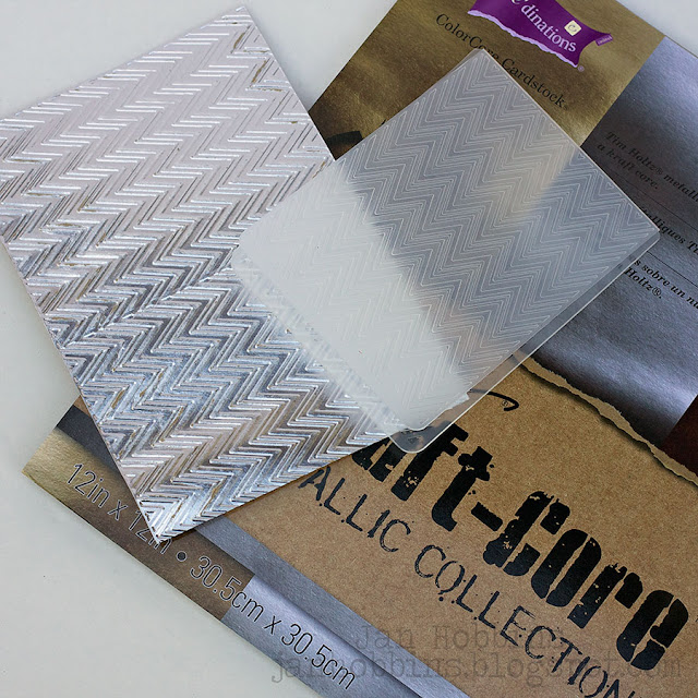
My cover started out with embossing a piece of silver Kraft-Core Metallic paper and Tim's new ZigZag embossing folder (Sizzix 660972). My piece was large enough to emboss the folder twice, side by side.  It is cut to fit inside the border line on the book cover.


This metallic paper is quickly becoming a favourite of mine.  It handles embossing, different mediums, and love how it looks when distressed.  Once I had my paper embossed, I applied Ground Espresso paint first, let dry a few minutes, and then wiped the paint off, leaving it in the recessed areas.  Next, I applied Picket Fence Distress paint (not as much as the brown), wiping off the excess.  If it's too white, just repeat, applying a bit more brown.  Let this dry.


I decided to add more dimension to my embossed paper.  I made up a mixture of Ranger's Matte Transparent Texture Paste with a bit of Wilted Violet Distress Spray, small amount of Wilted Violet and Ground Espresso paint.  With the spray, you still retain a bit of that transparent look from the paste, but it is more liquid so your paste will be thinner the more you use. I applied this coloured texture paste randomly with my Tim Holtz (THS046) Batground Stencil. After this has dried, apply Ground Espresso paint on the bats and wipe off the excess so there's just some remaining in the recessed areas.   Adhere to the front cover of your book.  I applied a thin strip of Tim Holtz  Regions Beyond Design Tape (TH93228) around the edges of the embossed sheet for a finished border.


Now onto this awesome skull! This is Tim's new Skull Bigz die.  I applied a piece of Ranger's Metal Foil Tape Sheets to chipboard and die-cut my skull.  I applied Distress paint in the same way as my embossed sheet.  First applying a bit of violet, wiping off excess, then applying the Ground Espresso, wiping again.  I also distress my die-cut with Tim's Tonic Craft Scratcher before painting.  This is a wire brush tool that when you pounce it or scratch, it creates an aged or weathered look.


I traced the skull shape onto a piece of  a Tim Holtz Deco Sheet (antique Silver).  This adhesive backed sticker was adhered to a piece of cardstock before cutting out.  It was coloured with Tim Holtz Plum Alcohol ink.


The glittered sheet was pop-dotted underneath the  chipboard skull die-cut.


 Before adhering my skull, I die-cut two bats from Sizzix Tim Holtz Hocus Pocus 660962 and metal foil covered chipboard. These were embossed with Sizzix's Tim Holtz Formulas Embossing Folder (659451)and painted with Wilted Violet paint the same method as the other foil papers. I also die cut two splats from the Tim Holtz Sizzix Scribbles and Splat Thinlits Set (660222) and purple Core-dinations Distress cardstock.  These were painted on the edge with Wilted Violet paint, then Crackle Glossy Accents applied over top.  Ground Espresso ink was applied in the cracks after this had dried.


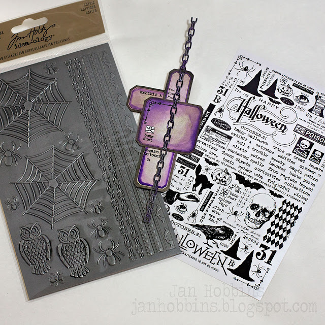
The labels were cut out from the Tim Holtz Regions Beyond Mini Stash paper pad(TH93226).  These were inked with Wilted Violet markers, then a water brush pen applied to give them a water-colour look. Curiosities Remnant Rub-ons were applied.  A chain strip from the Gothic Industrious stickers (TH93236) was adhered on top.  Adhere these and the die-cut splats  and bats to the album front.  Then adhere the skull.


My flowers were made with Sizzix Tiny Tattered Florals Thinlits dies and Kraft Core Metallic Paper.  I coloured the metallic paper with Plum and Espresso Alcohol ink before die-cutting the flowers.  Build your flowers.  I also die-cut three layers of petals for one slightly larger flower from the Bigz Tattered Flower die. This flower was held together with one brad from Regions Beyond Fastener Package.


Adhere the flowers beneath the skull and adhere one of the bats on top of the large flower.  


The word Halloween and a small bat from the Wicked Alpha Parts (TH93233) set were sanded and Wilted Violet paint applied lightly on top.  These were adhered to the album.


Tim Holtz Crinkle Ribbon was dyed with Wilted Violet and Brush Pewter Distress Spray Stain and tied onto the Clock Key.  Ribbon from Halloween Trimmings (TH92328) was also added.  Charms from Oddities Adornments (TH93230) were hung on the clock key with a Loop Pin (TH93200).

For the Inside of my book, I kept it fairly simple.  I used a few of the Large Page Pockets that work with the Worn Covers.  The other pages are chipboard cut to size.  The paper used is the Tim Holtz Regions Beyond 8x8 Paper Pad, along with the Frightful Ephemera Pack, Metallic Kraft Core Paper, Curiosities Rub-ons, Gothic Industrious Stickers and bits and pieces from my stash of Idea-ology products. One of the pages was a Frost Film Sheet with an embossed Cobweb texture fade on Ranger's Metal Foil Sheets, also painted.  Here's a sampling of some of the pages:


A die cut from the ephemera package inside a Mini Cabinet Card.  A bat from the Wicked Alpha Parts is at the bottom.  Another embossed sheet of metallic Kraft Core Paper.


A paper mat accented with photo corners from the Industrious Frames & Trims stickers.


A Frosted Film sheet as the main page is accented with a torn piece of Adhesive backed Metal Foil that was embossed withthe Cobweb Texture Fade embossing folder.  This was also painted in the same way as the other embossed pieces.  The inside piece was a metallic kraft core piece of paper folded, distressed and die cut along the edge with the Tim Holtz On the Edge Torn Notebook (658555) die.


A page pocket filled with pieces from the Ephemera Pack.


A large pocket was made from a patterned piece of paper and adhered to the bottom of the page.  A border strip  from the Industrious stickers is adhered to the edge. The three pocket edges were slightly larger than the page, these were scored, adhesive tape applied and turned inside, then adhered to the page.  This can hold notes, additional photos, etc.


Another pocket page filled with papers and ephemera.


A pocket page filled with papers and ephemera.  I also had some leftover pieces of metallic embossed paper (with the texture paste bats) that I did while experimenting with different colours.  Keeping these scraps come in handy, when you need small accent pieces.


A spider web sticker from the Industrious set with Idea-ology spinners and a spider sticker held with a brad in the center.

A mini album or book is a great way to document an occasion, trip, or one subject.  It's also a good way to use up those bits and pieces left over from past projects.  I chose a neutral colour as my main colour throughout the book, adding in a few accents colours, making it easier to find or alter embellishments and photos to match.   Even inking, dry embossing, or using markers can change the look and colour of embellishments or your paper to give your project an unique look.


Here's another look at my finished album.  Hope you enjoyed this tutorial!  Don't forget to visit Tim's blog to find more  Halloween inspiration!

I also wanted to thank everyone for visiting here and all the kind comments on my posts, they are much appreciated!

Have a great day,

Jan
35

The Undertaker Ornament

Hello everyone!  Thanks so much for stopping by!  I feel so lucky and honoured to be asked, along with a group of extremely talented crafters, to showcase the Summer 2015 release from Tim Holtz.  It's always so exciting to receive that wonderful box of goodies.

This month we are all sharing our Halloween projects, so keep checking Tim's blog for lots of inspiration!  Last year I created a Christmas Ornament for the Tim Holtz Media Team and had so much fun creating it, I decided to do something similar but with a Halloween theme.  Here's my Undertaker's Poison Shadowbox Ornament:


Love this Tim Holtz Undertaker's stamp set(CMS240) from Stamper's Anonymous! This large image was the starting inspiration for my ornament.


I started by die-cutting my Tim Holtz Cameo Frame (Sizzix 658570) with Little Sizzles Black Mat Board (Sizzix 656852).  This die is a Movers & Shapers die which means a small magnetic die can be placed in the center opening to cut out a shape inside the die-cut.  I used the smallest rectangle from the Set of Three Rectangle set (Sizzix 658568) and placed this in the center.  I first cut it out in mat board and then patterned paper from the new Tim Holtz Halloween paper stash called, Regions Beyond.  This paper pad comes in an 8 x 8" size with 24 papers.  I wasn't sure what paper I wanted to use (there's so many good ones!), that's why I did them separately, you could always adhere the paper to the board first and then die-cut.


Next, I die-cut the box piece of the Sizzix Matchbox(659447) with Ranger's black cardstock.  This fits perfectly behind the rectangle opening.  I folded up the two shorter ends to the inside, but the longer ones, I creased the outer one(theres two fold lines) to the outside.  This is what I glued to my backside of the frame.


For the inside of the shadowbox, I adhered a small card from the Frightful Ephemera Pack.  I also used  some "Regions Beyond" Design Tape along the inside edges.


This is how the back of my frame looks with the small box adhered to it.


The edges were inked with Walnut Stain Distress Ink and then Tim Holtz clear Rock Candy Crackle paint was applied all over the frame.  Let this dry, and then ink Walnut stain and Frayed Burlap Distress ink over the cracked frame.  I lightly wipe with a baby wipe, so the ink just stays in the cracks.


I needed a small base to glue my leaves and Undertaker to, so I used small pieces of foam.  I save these small pieces from Sizzix's embossing folder packages, they come in handy for extra thick pop dots.  I adhered one on the top and bottom with a hot glue gun.  I also coloured the outside with a permanent black marker so it blended in with the black frame.  Now onto the embellishments!


I stamped three images on Ranger's Speciality Stamping paper, one with black, the others with Walnut Stain ink.  These were all embossed with clear embossing powder.  


The black image is the bottom layer.  The middle layer is the whole image, but I cut out the eyes and nose part with a craft knife.  This was pop-dotted on top.  For the third image, I cut off the hat, which is pop-dotted on the previous layer.  I used a Black Soot Distress pen for the edges and Hickory Smoke, along with a water pen to shade in the images.


Here's a close up of my Undertaker.


I wanted some larger leaves to hold  all the smaller ones, so I used the Tim Holtz Layered Leaf Bigz Die(660039) and it's matching embossing folder.  Mat board, Regions Beyond patterned paper, and Tim's Metallic Core-diations paper were used for my four large leaves. These were lightly sanded and inked with Walnut Stain Distress Ink.


All my smaller leaves were die-cut with the new Tim Holtz Fall Foliage Thinlits 14 pce. die set (660955).  Look at all those wonderful leaves!  The edges were also inked.


I used a hot glue gun to adhere the larger leaves first.  I made a slit in the top of the foam (about 1/2" deep) in the middle, and inserted a bit of one leaf.  Next came all the smaller leaves.  The larger spider and cobweb is part of the Gothic Industrious Stickers pkg(TH93236).  The web sticker was stuck to some Tim Holtz Wallflower vellum, then trimmed along the outer edge and a few inside parts with a craft knife.
My Undertaker was adhered last.  The word "Poison" and small spider is part of the "Wicked" Alpha Parts (TH93233), which was lightly painted with Ripe Persimmon Distress Paint.


My small shadowbox is filled with a Tim Holtz Apothecary vial (TH93231), die-cut leaves, a resin Skull from the Boneyard pkg.(TH93229) and a spider from the Oddities Adornments (TH93230)pkg.
Around the edge of the rectangle opening is tape from the "Regions Beyond" Designer Tape pkg.(TH93228).


There's six great ribbons in the Halloween Trimmings package (TH92328).  Love this stitched orange and black one!  I think these Crypt Cameos(TH93232) are my favourite embellishment in this release.


I finished off my ornament by hot gluing a ribbon hanger to the back.

Hope you enjoyed my tutorial and it inspires you to create your own Halloween ornaments!  Check out Tim's blog  for more inspiration and take a look at his new Stamper's Anonymous Stamps, Sizzix Dies, and Idea-ology new releases.

Thanks so much for visiting and see you soon!

Jan
37

Zombie Halloween Card

With the cooler temperatures arriving and the leaves changing, I'm definitely in the Halloween mood.  I love the look of silhouettes, and when you throw in some orange and white, pure Halloween!


This card was made with the new Sizzix Tim Holtz Zombie Thinlits die.  Isn't he cool?


It has lots of dimensional pieces to give your die-cut a 3-d look.  When you die-cut the main head part, it also slightly embosses the areas where you adhere your corresponding parts.  No second guessing where each part goes and there are step by step instructions on the back of the die picture sheet.  I used black Chalkboard cardstock to die-cut my zombie.  Love this paper, it has a rich velvet look to it.


Here's my Zombie all pieced together.  


For my card background, I embossed orange cardstock with the Tim Holtz Cobwebs texture fade.  Two pieces of chalkboard cardstock were die-cut using the Tim Holtz Postage Stamp Frame.  Instead of using the postage stamp part, I used the negative part of the die-cuts for my card background.  It's really hard to see in the photos, because of the black colour, but I layered the two pieces with pop dots for added dimension.  The top piece was slightly smaller (about 1/8" all the way around).These rectangle pieces were cut down to the size I wanted, so my original size of cardstock was slightly larger than I wanted the finished piece to be.  I like to start off with a slightly bigger piece, just so there's some room to play with in case your inside cut is off.  I also die-cut a postage stamp in white cardstock, this time using the stamp die-cut.  There is a scored line on the inside all the way around, and I cut along this line with a craft knife, turning it into a frame too.  This white piece fit into the top black frame and I taped it from the back.


The Zombie was adhered to the orange piece, and then the bottom black frame was adhered on top.  The top frame with the white insert was pop dotted on top.


My "frightful" word was die-cut twice( one from black and one from orange cardstock) from the Tim Holtz Halloween Script Words.  These were adhered together, the black slightly off underneath the orange.  I always get asked what kind of adhesive I use for these really intricate dies, and the one I use the most is the Zig Squeeze and Roll glue pen.  It has a nib like a ball point pen and when you squeeze the plastic part at the top, a small thin line of glue comes out.  It's fast and easy.


Once all my card layers and word were adhered, I glued this to my white card base.  
I'm loving this silhouette look with the orange, I need to do another one!

Thanks for stopping by, and hope you come over to visit me tomorrow.  I have a special post here for Tim Holtz!


Jan


2

HALLOWEEN TREAT BAG TUTORIAL

Need some Halloween inspiration?  I have a tutorial on how to create this treat bag on the Sizzix blog today!


Hope you join me there!

Jan
2

IT'S PARTY TIME WITH THIS CIRCUS BANNER!

Good morning fellow scrapbookers!  Today I'm sharing a fun Circus Party Banner:


I love this collection from Carta Bella, called Circus Party.  I don't know why, but I'm attracted to the vintage circus look.  This has a bit of that look but with a colourful, festive look to it.


Do you ever have this dilemma?  I like it, want to buy it, but what can I make with it?  Working in a scrapbook store has it's dark side…. you like everything that comes in and want to have it all!  When I saw this awesome Sizzix Banners Framelits set, I knew this collection would make a great banner.


This is a big 34 Framelit piece set, made for the Sizzix Big Shot Plus Machine (it has a larger 8 1/2" width), but the largest banner framelit is 4 1/2" wide, so it will still fit into your regular Big Shot machine. I guess they were thinking that you could cut out multiple pieces at the same time on the larger machine. All these pieces cry out for lots of layers, right?!  This is such a great set, with so many possibilities.


I cut out all my pieces for my banner using the same shapes. The Sizzix Sandwich I used for these Framelits is; Magnetic Platform, Standard Cutting Pad, Paper, Framelits(cutting Side down), Standard Cutting Pad. Because I'm using busy patterned paper, I like to use a solid cardstock in-between each pattern.  You don't need much in-between to define each layer.  I adhere the patterned paper die-cut to a slightly larger piece of cardstock and trim that cardstock about 1/8" bigger all the way around, using the die-cut as my guide.  For the straight parts you could use a rule and craft knife to get a nice straight edge.  This really makes the different layers stand out more.  I also used pop-dots to create more dimension between the different sized layers.


Using the Carta Bella coordinating stickers, I adhered these to black cardstock, then cut them out, leaving a narrow border around each sticker shape.  These were added to my banner pieces.  I also cut out the word, "Party" from the Sizzix Tim Holtz Word Play Bigz XL Alphabet die in black cardstock.


After adhering my stickers and die-cut layers, I added in a few enamel dots and small star and button stickers.


The banners were attached together with three different colours of twine which were knotted on either side of the banner before stapling with my Tim Holtz Tiny Attacher.  I tried  to staple them so the knot would cover the staples.


The black letters were also pop dotted to stand out.


Hope you like my fun banner, and it gives you some inspiration for creating one, for any occasion.

Thanks for stopping by,

Jan

1
Back to Top